💼 Content Design Portfolio
🛠 Experience & skills
Web and app microcopy
Product descriptions
Navigation
Information Architecture
Marketing headlines and body copy
Content principles
Writing guidelines and KPIs
Content templates
Plain language
Modular design and content
Content best practices training
📜 On this page
📱Cigna wellness app
WHAT: A mobile MVP for web, iOS, and Android
WHY: Help people achieve balanced wellness
HOW: Make participation easy for people of all ability levels — but with challenging enough activities that Cigna's client corporations would be happy to give employees money back on their health plans for participating.
MY ROLE: As content design lead I led content strategy, wrote UX copy, managed a copywriter, and made product decisions in collaboration with the lead UX designer, product owner, and client stakeholders — product, clinical, brand, legal, and dev.
How content design was integral to the product
ACTIVITIES:
I curated a list of activities plus supporting content with client stakeholders, who wanted 180 activities for MVP.
I knew this was unachievable in the timeframe, so I workshopped them down to 24 key activities backed up by their health plan data.
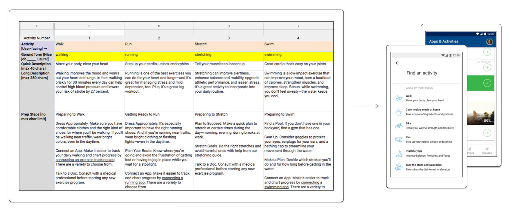
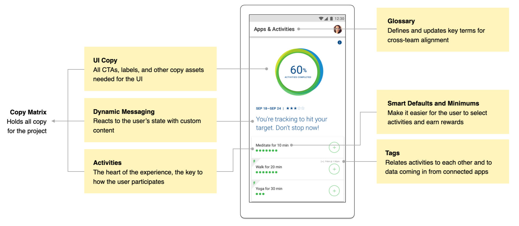
How activities and supporting content appeared in the app
COPY: It’s critical to have a single source of truth for content. UX copy lived in a huge Google Sheet which was linked to the client’s test servers for real-time updates.
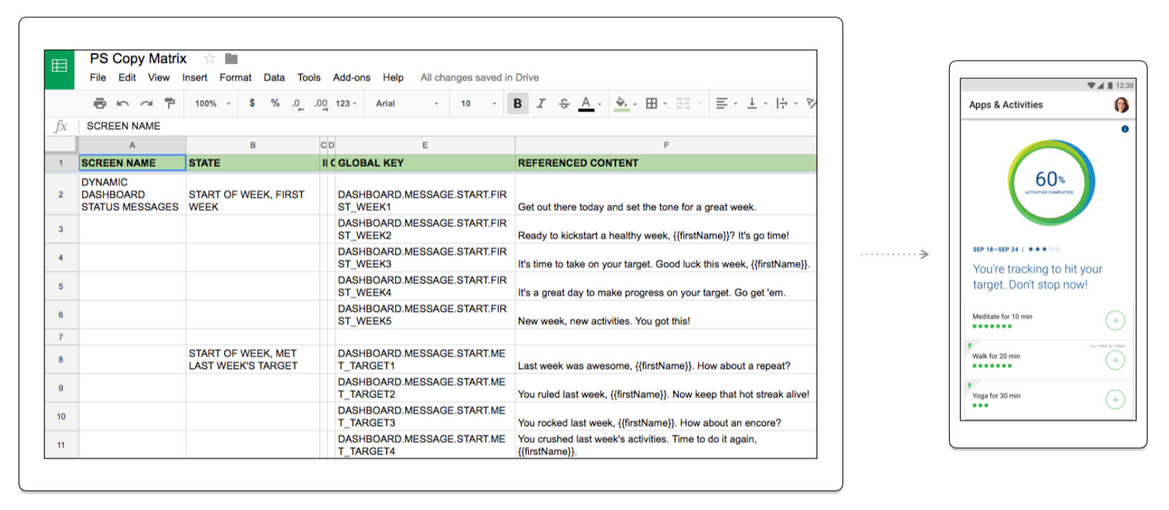
The copy matrix that served as the MVP CMS
CONTENT TAGS: As content always exists in relationship with other content, I created content tags to connect activities to each other — enabling smart activity suggestions — and to data from connected apps like Fitbit and Strava.
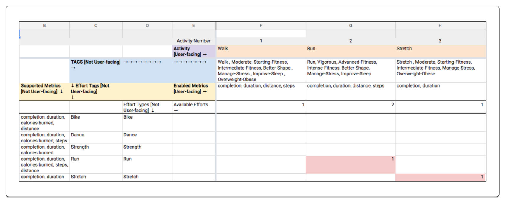
Communicating content tags required spreadsheet acrobatics
DEFAULTS AND MINIMUMS: To help customers choose reasonable activity amounts — and set targets to earn money back on their health plans — I worked with the client to set up a system of smart defaults and minimum activity efforts.
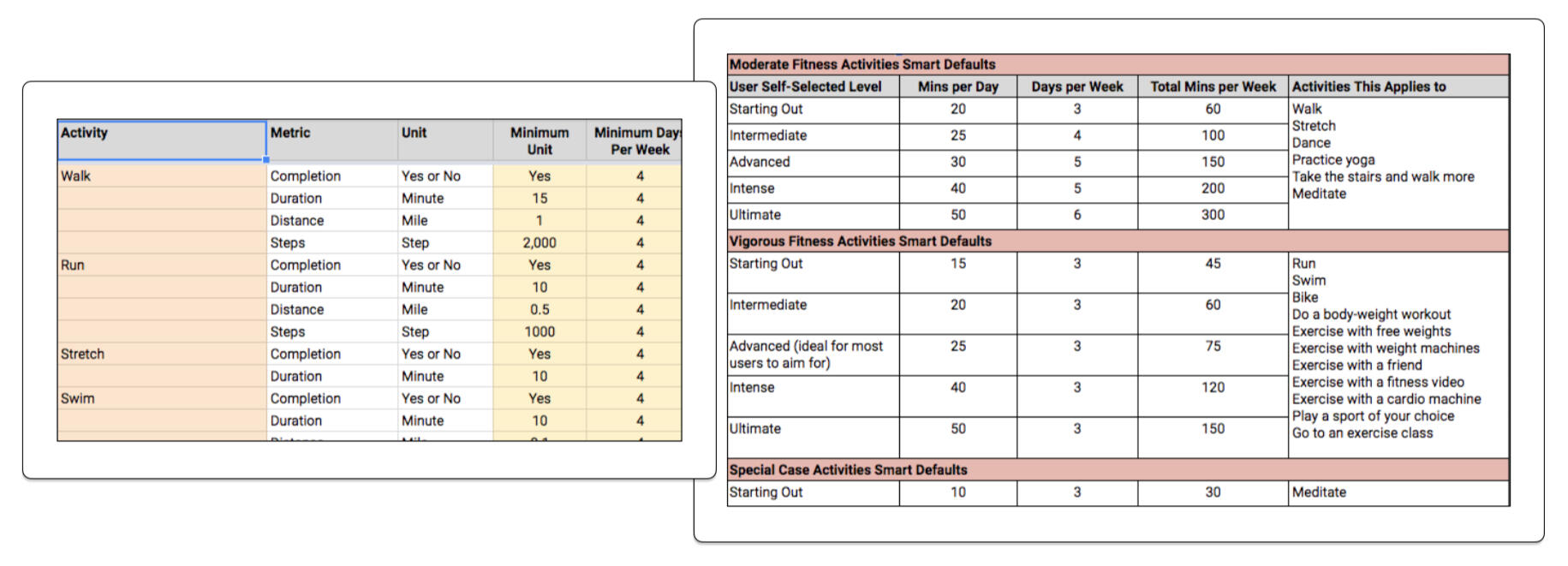
Defaults and minimums were part science (what would impact health) and part art (what corporations would accept as valuable effort)
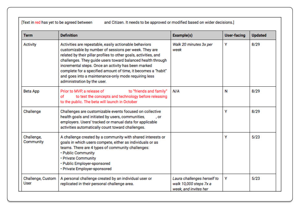
GLOSSARY:
Content design can be the glue that holds cross-functional teams together as we collaborate with design, research, and engineering to deliver good UX.
To keep everyone on the same page, I managed a list of project terminology.
Language changed, sometimes daily, so capturing and reviewing content decisions was hugely valuable.
Defaults and minimums were part science (what would impact health) and part art (what corporations would accept as valuable effort)
💻 An $80B healthcare system's AI physician dashboard
WHAT: A mobile web POC (Proof Of Concept) for PC or tablet
WHY: Help small staffs manage large patient groups with AI assistance
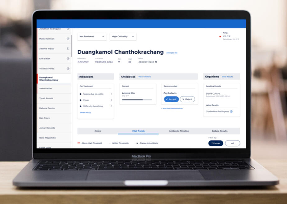
HOW: Present complex data from multiple sources with AI recommendation so a doctor can quickly and easily review it — for example, on a tablet while walking through a hospital, saving physician and clinician effort by automating a currently manual process
MY ROLE: As content design lead I led content strategy, designed content-first user flows, wrote UX microcopy, and made product decisions in collaboration with the lead product designer and client stakeholders — data scientists, pharmacy technicians, and physicians.
We designed the experience within the constraints of the existing brand palette and data tool.
RESEARCH AND REQUIREMENTS: The lead designer and I ran stakeholder user interviews with physicians and pharmacists, and collaborated with data scientists and engineers to create a POC specifically for managing inpatient antibiotic treatments.
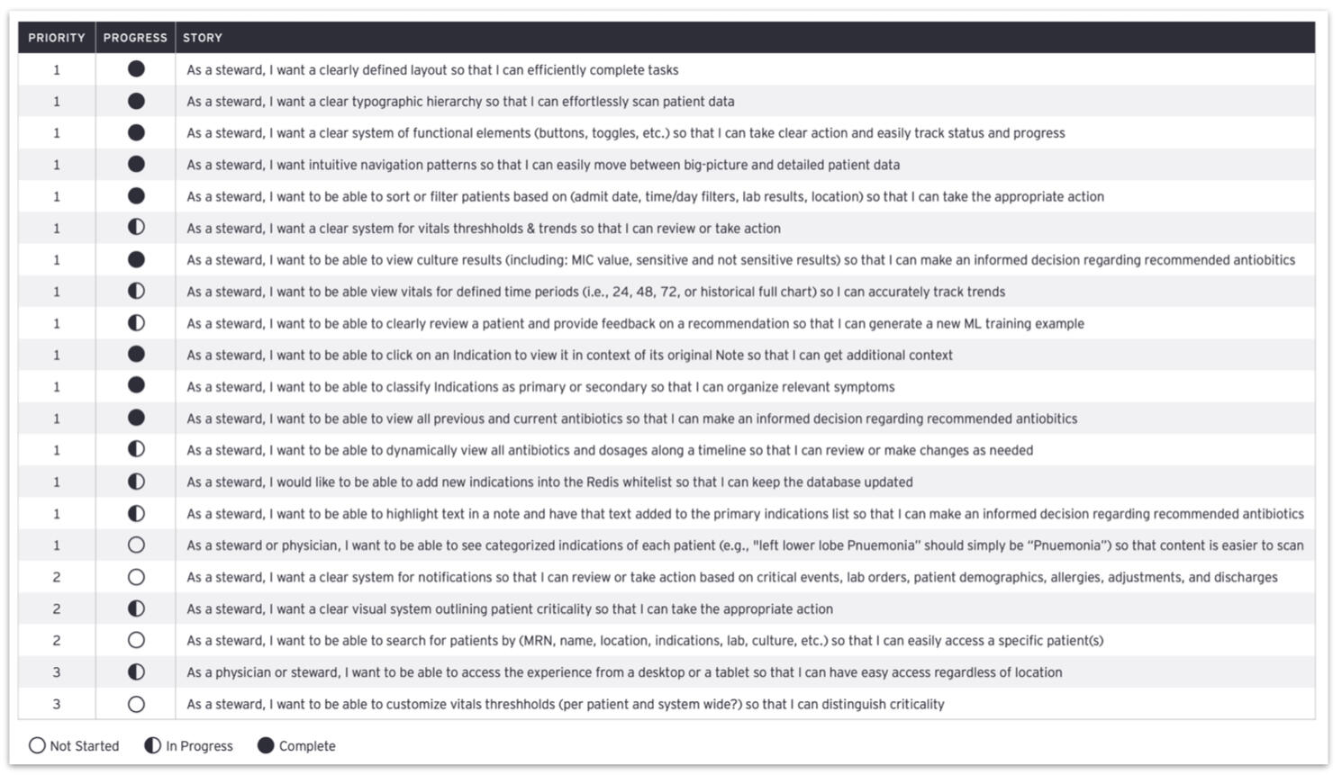
We collected and managed user stories with our data scientist clients, updating them with weekly progress checks during the 8-week engagement.
MODULARITY: The modular design and content placed a lot of information at the physician’s fingertips, pulled from a wide variety of data sources.
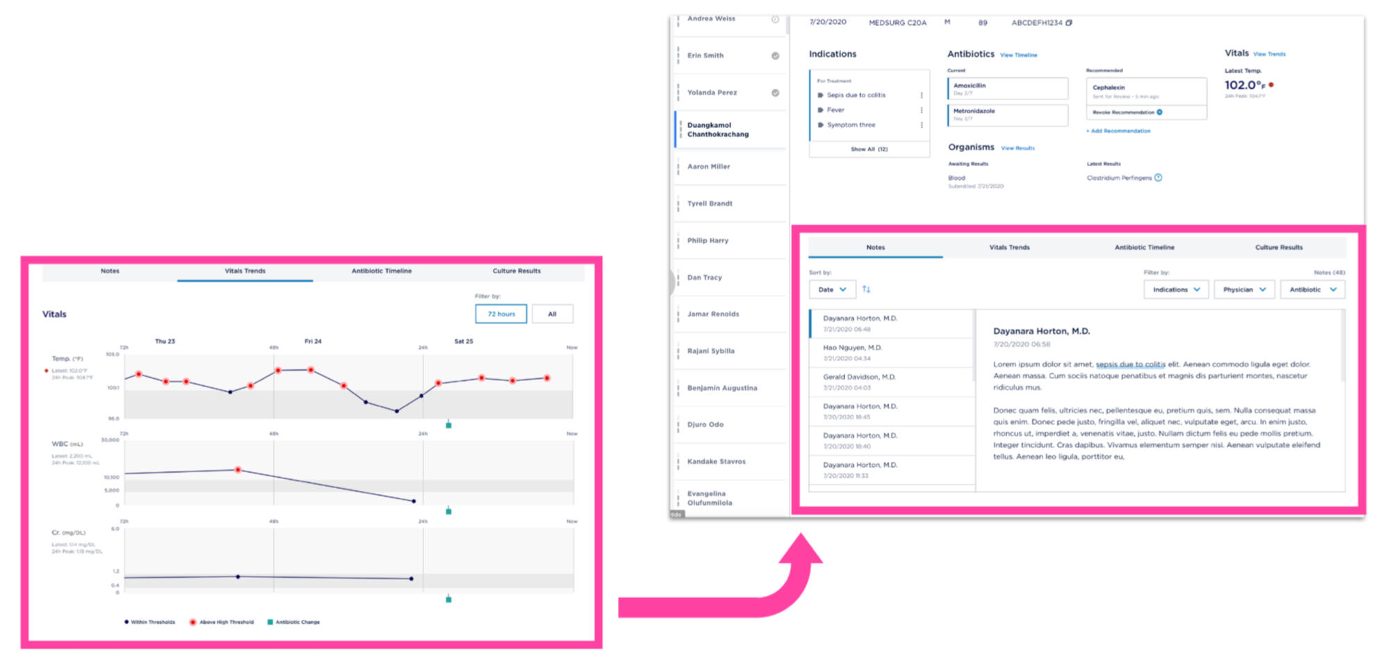
Scrollable tabs allowed for different formats, sizes, and lengths of content to work in the same area.
MICROCOPY: I developed all microcopy using the client taxonomy as well as feedback from physician and pharmacist users. The goal was simple, consistent language for split-second decision making in training the AI.
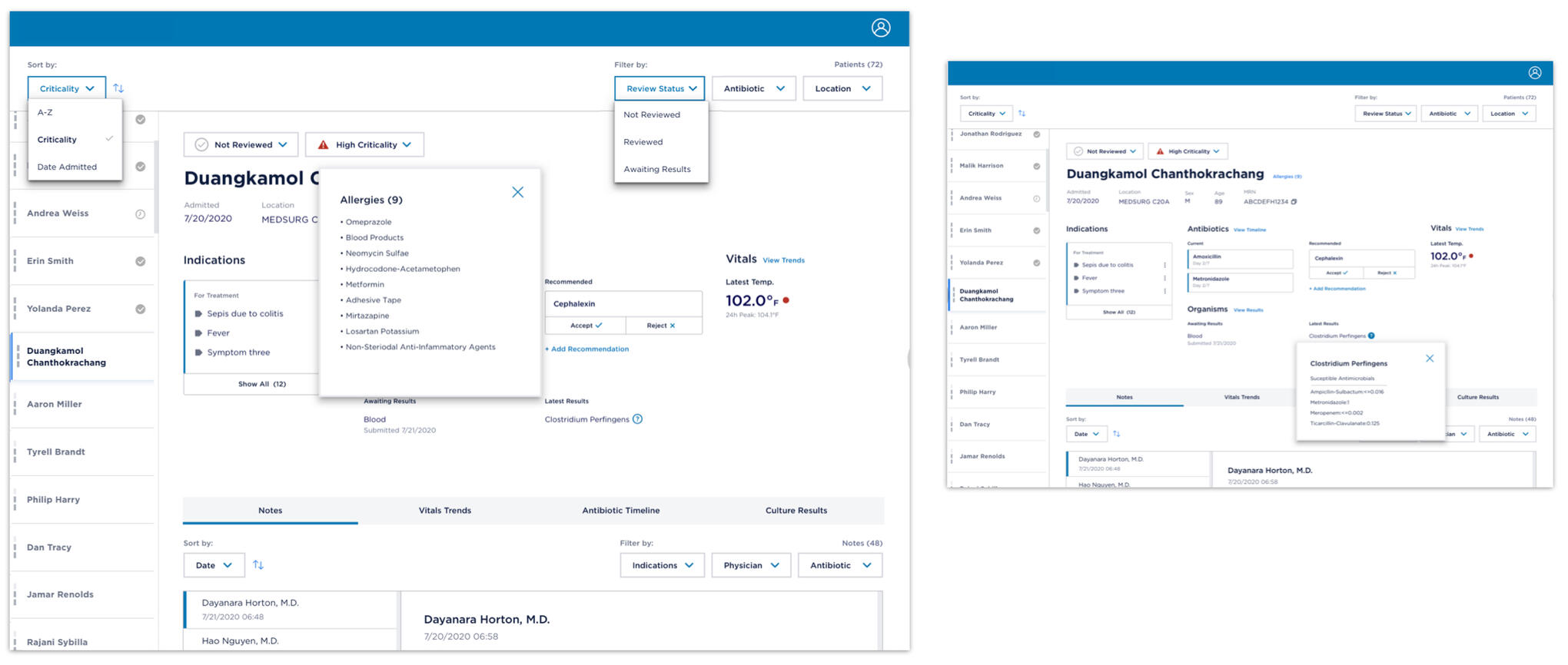
Limited use of colors, modals, and dropdown menus enabled quick filtering and status updates with the right amount of speed and urgency.
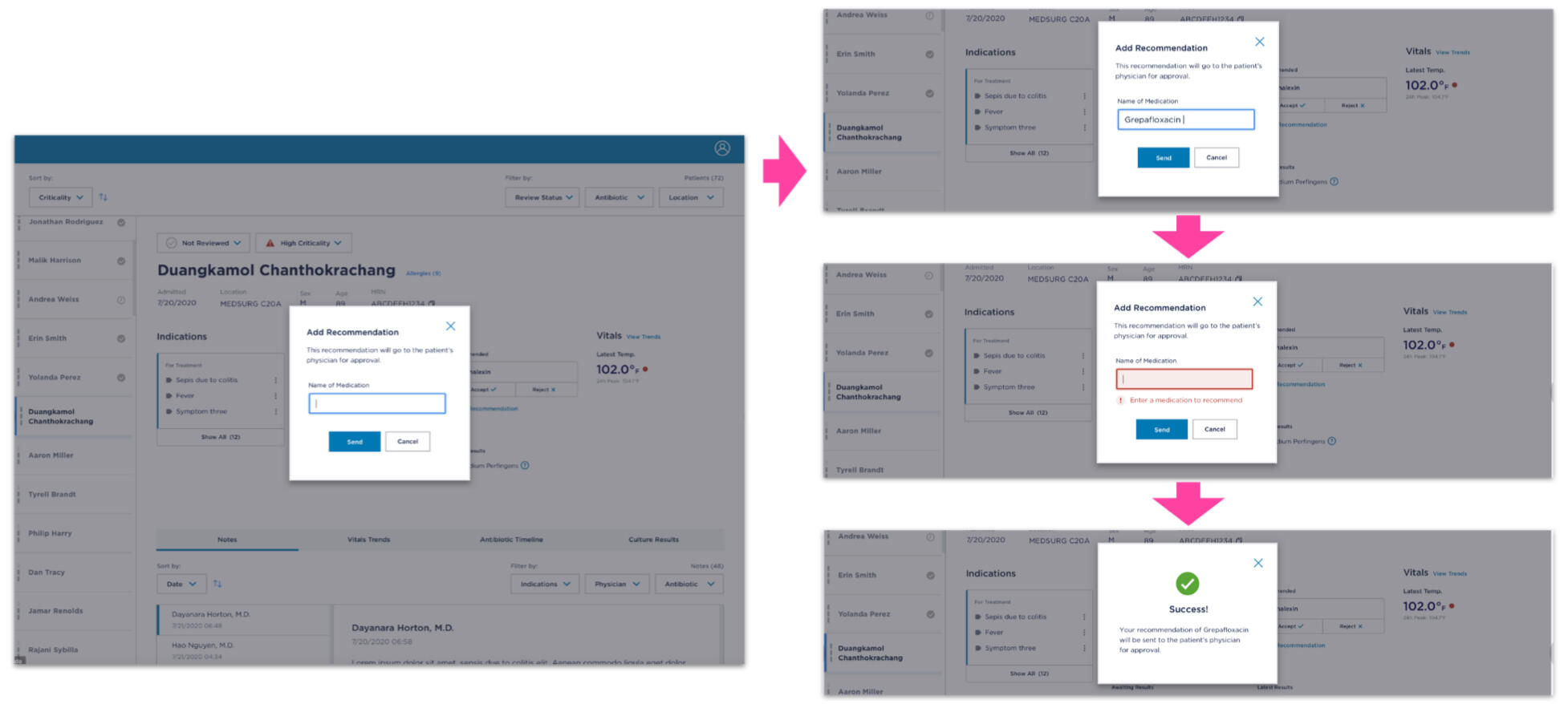
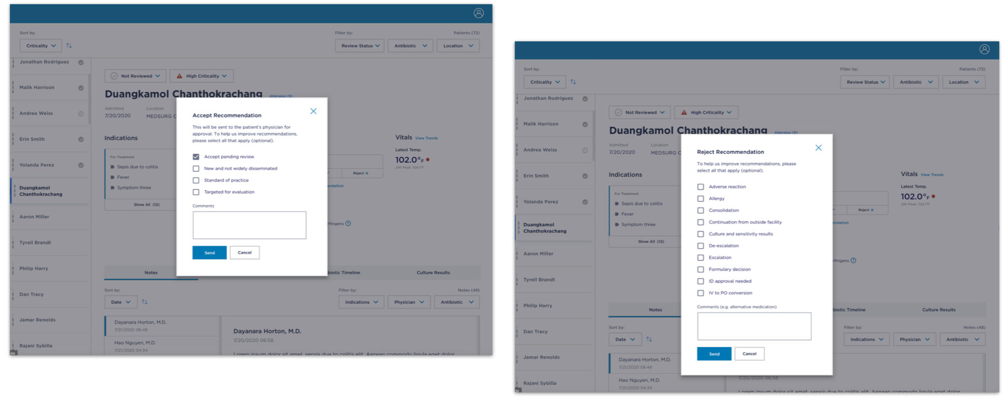
To speed interactions, we used the least number of words possible to be absolutely clear without help copy — consulting with clinicians and physicians — multiple choice to decrease effort and error risk, grayed-out focus states, and augmented limited brand guidelines with colors for errors and successes.
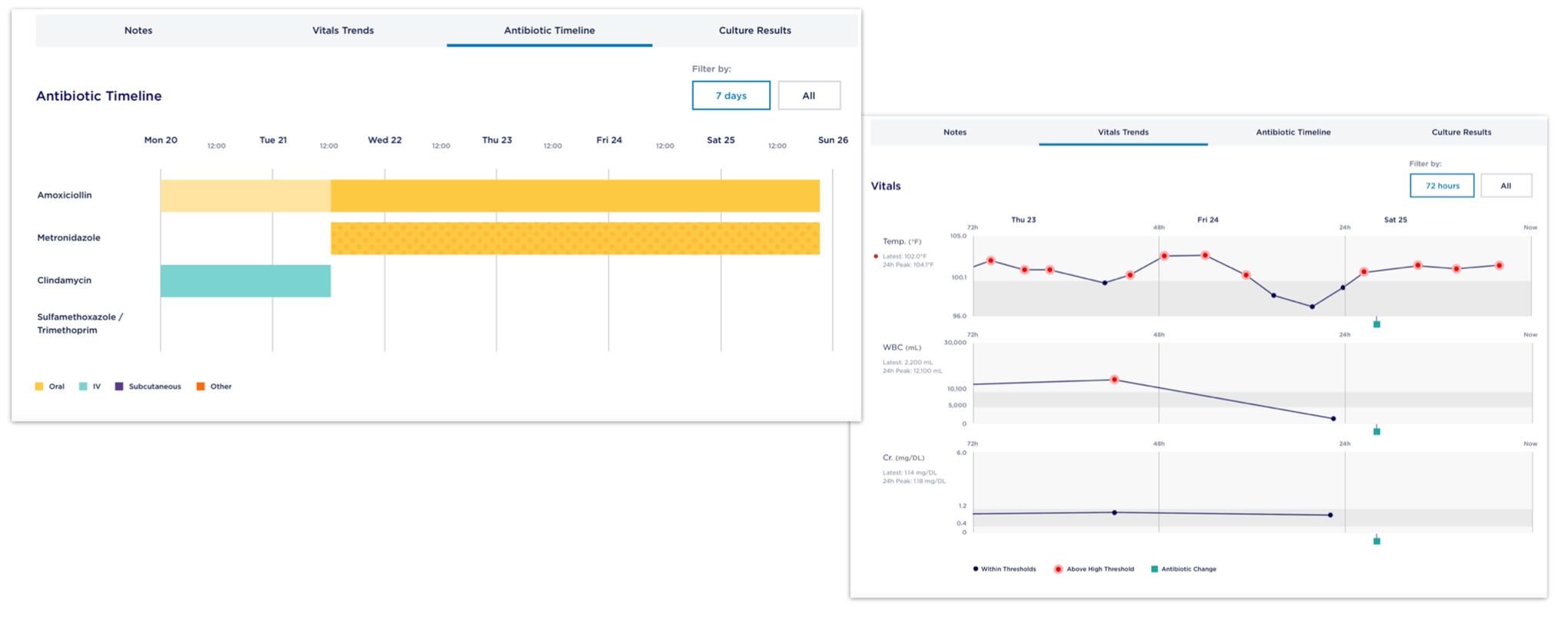
Multidimensional graph components added microcopy labeling and design challenges.
DOCUMENTATION: As efficient and highly usable documentation for our data scientist clients, I created a stakeholder copy deck that clearly laid out the nomenclature — sections of the dashboard, variables, and labels for each.
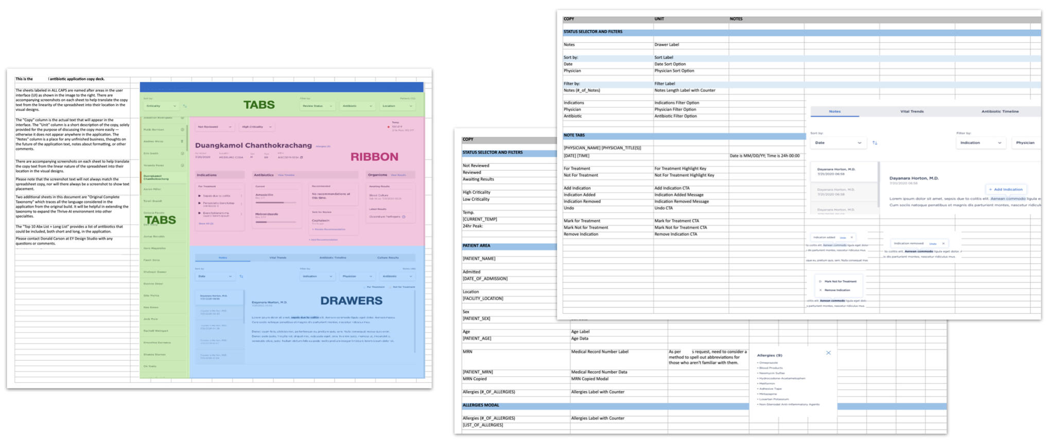
Documentation used agreed-upon terminology and was as sparse as needed to help the client parse the designs rather than provide a handsome but less usable souvenir.
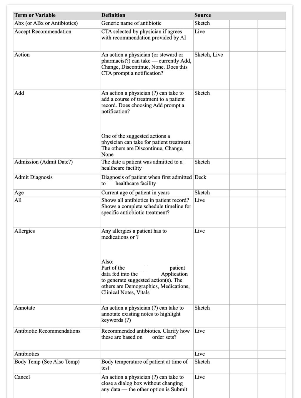
As I usually do, I created a glossary of terms to keep track of the many medical, organizational, data, and other terms agreed with stakeholders during our research and design process.
🧱 SAIF's content design & strategy
WHAT: Content and design specifications for an upgrade of SAIF's website — plus a core component code library for SAIF to make changes without our help (SAIF — State Accident Insurance Fund — is a nonprofit, Oregon state-chartered workers' compensation company).
WHY: Both SAIF and our team wanted us to do a complete redesign, but there wasn't budget — so we delivered guidelines and a code library to kick off the project and make the case for more funding.
HOW: We interviewed stakeholders to understand the business and the issues with the current website, agreed on the specific deliverables, kept them up to date with progress regularly, and then presented the final deliverable. Unfortunately there wasn't budget to talk to users, so we had to get our data indirectly from the client.
MY ROLE: As content lead 50% allocated to the project, I ran stakeholder interviews and content workshops, developed principles to guide content, and authored the content section of the deliverable deck, plus separate documentation with key webpages rewritten to follow the guidelines.
BUSINESS VALUE: Workers using SAIF's website may be in pain, stressed about money, or non-native English users. So in order for SAIF to provide maximum value at a very difficult time in its users' lives, the website must be clear, concise, and simple to use.
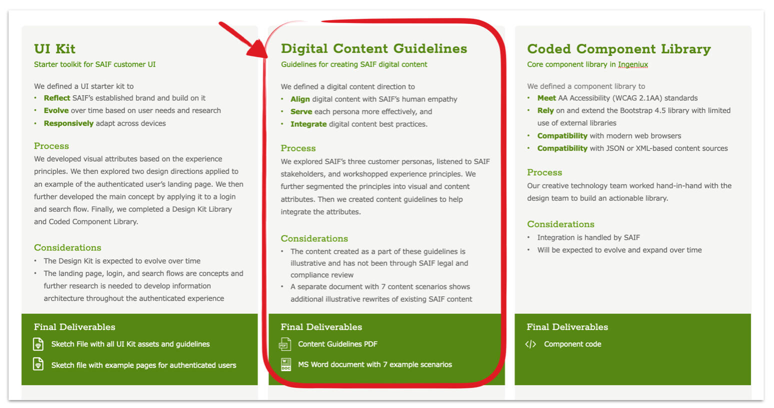
I was wholly responsible for the Digital Content Guidelines, as well as assembling and editing the final deliverable deck.
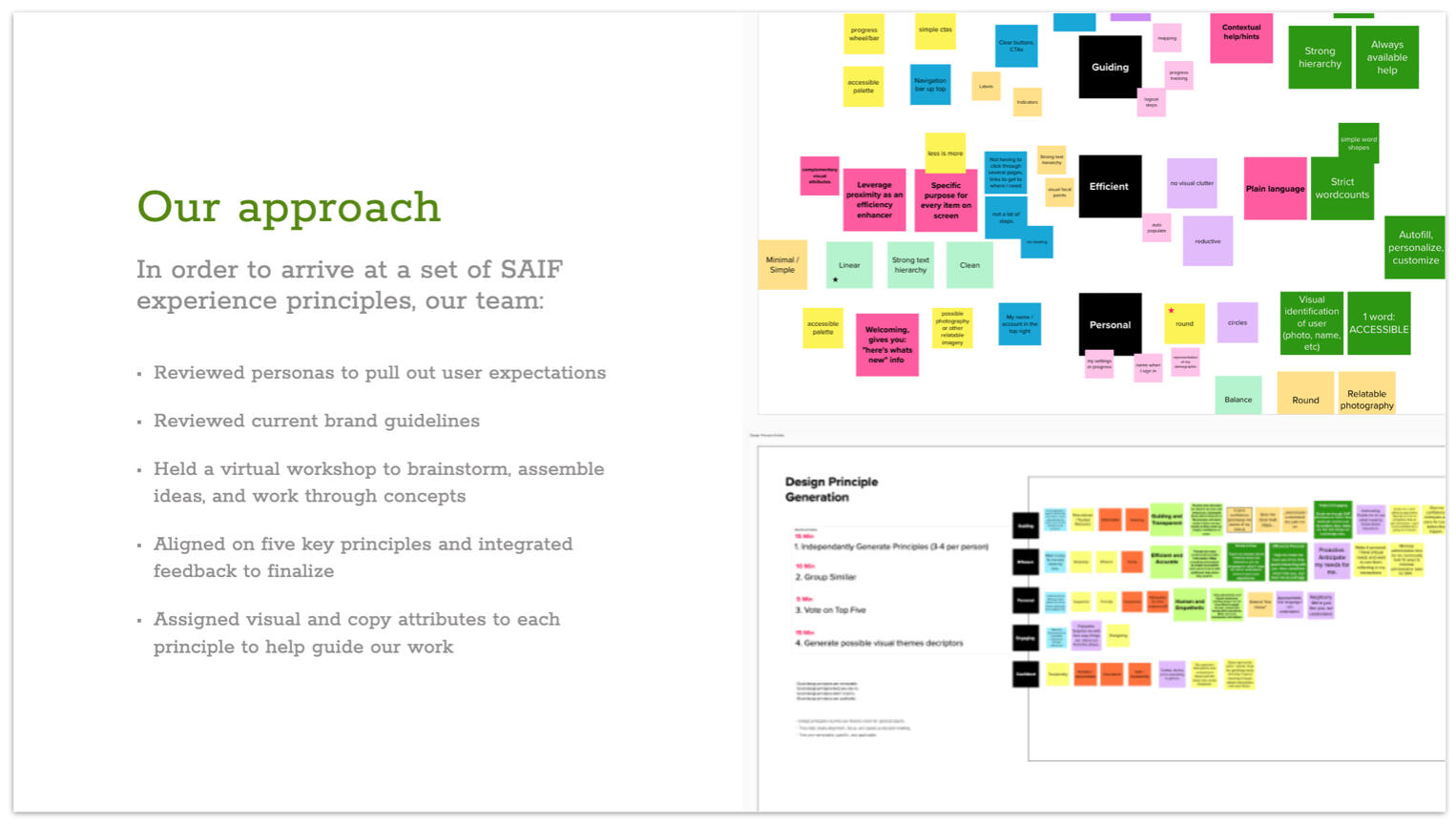
I led a virtual client workshop assisted by my UX design lead and the rest of our team to develop experience principles to guide the work.
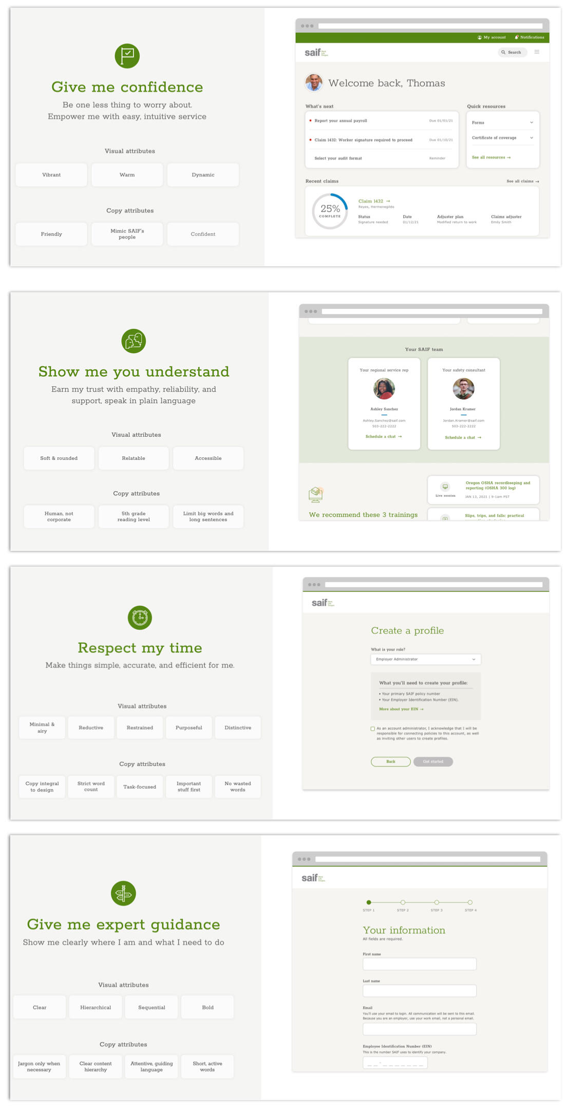
Each experience principle was illustrated with a concept design from the UI kit to show the SAIF team how the principle would shape their digital experience. The UX design lead and I worked on these together using the client's brand and persona documentation, and they were later added to the code library.
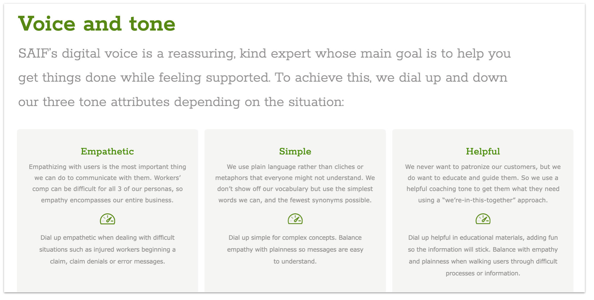
SAIF had no digital voice and tone codified, but they knew they wanted the website content to sound as helpful and caring as their staff. So I created, workshopped with the client, and iterated on that as the second layer of the content guidelines, after the experience principles, each one building on the other.
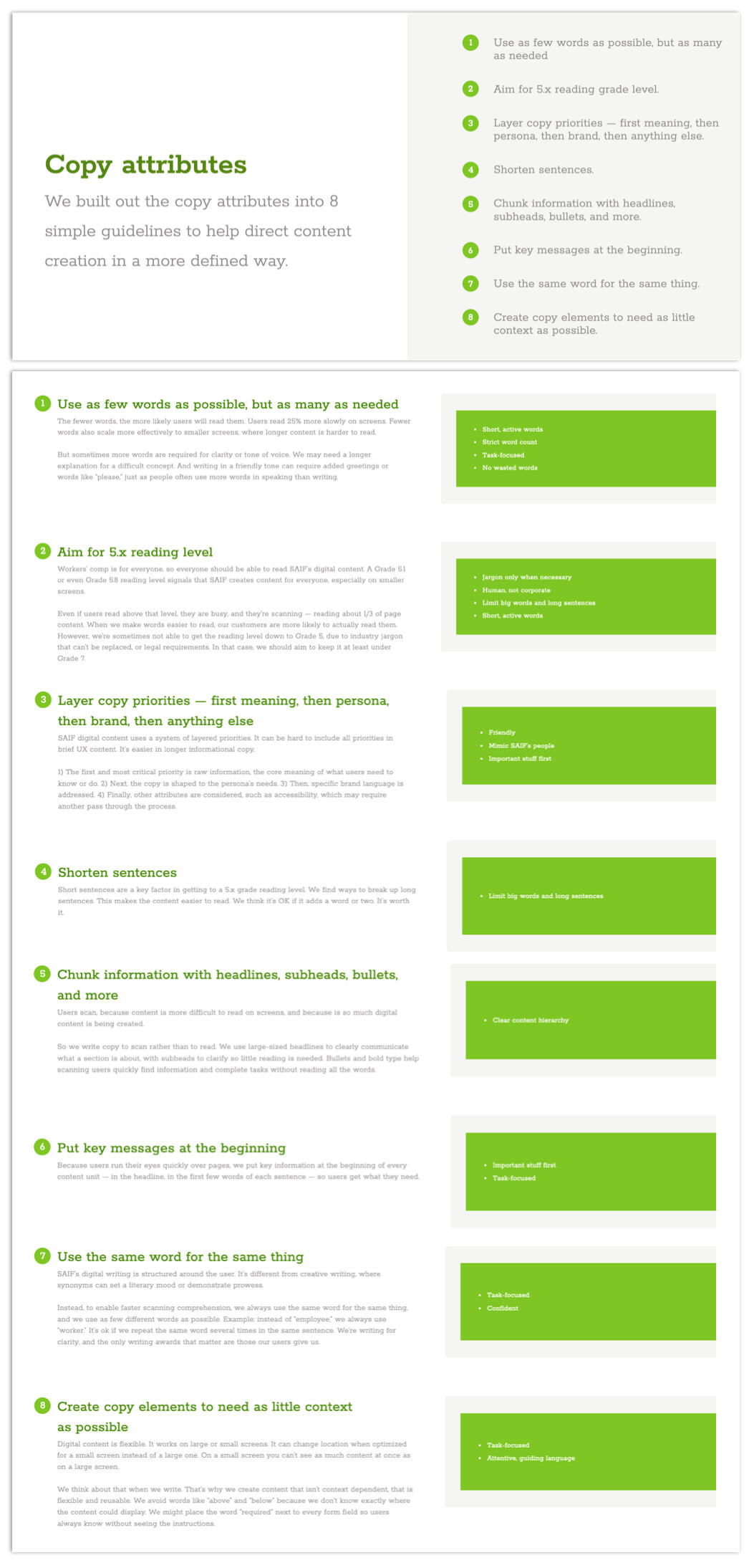
Copy attributes — basically best practices for content design that far too few organizations actually follow — were the final layer in the guidelines that explained exactly what rubric I had applied to create the rewrites.
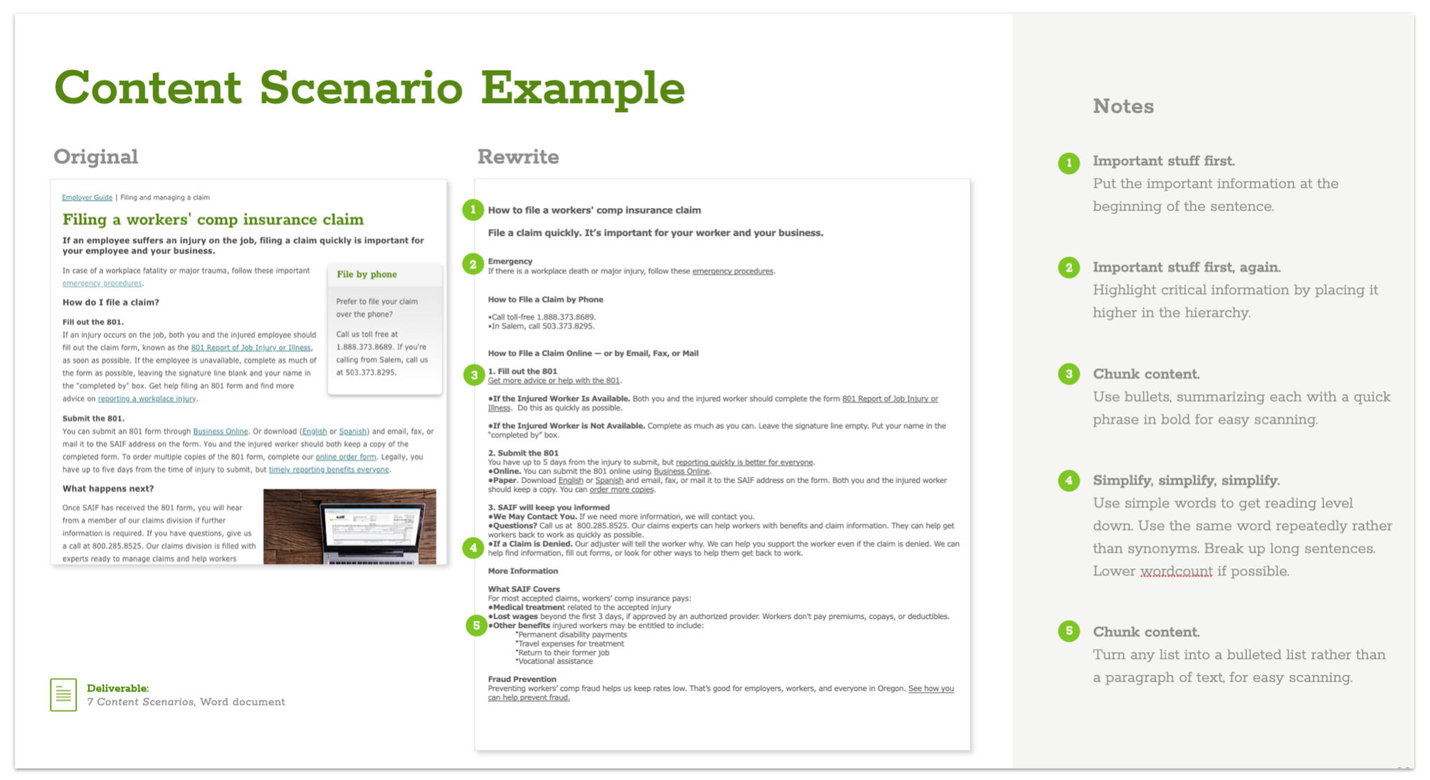
The final piece of the content guidelines were "content scenarios," or key agreed-upon page rewrites applying the experience principles, voice and tone, and content attributes. This gave SAIF (or, if they got the budget, whomever they hired in the future) a clear starting point for upgrading content when they were ready to make changes.
🗺 EY Design Studio content design deck
WHAT: A sales enablement and training deck for my then-employer
WHY: Provide a compelling picture of the value of content design for the sales and delivery staff, as well as train other consultants
HOW: Encapsulate the content design practice I had built over the past 3 years into a flexible deck engaging enough for a presentation but flexible enough to provide individual cut-and-paste slides to biz dev teams pitching clients on content work.
MY ROLE: I conducted a listening tour to discover key pain points for execs and managers in scoping and selling content, assigned slides to members of my team, then assembled content and continued to make additions as new issues arose. The formatting was identical to our pitch decks for easy cut-and-paste.
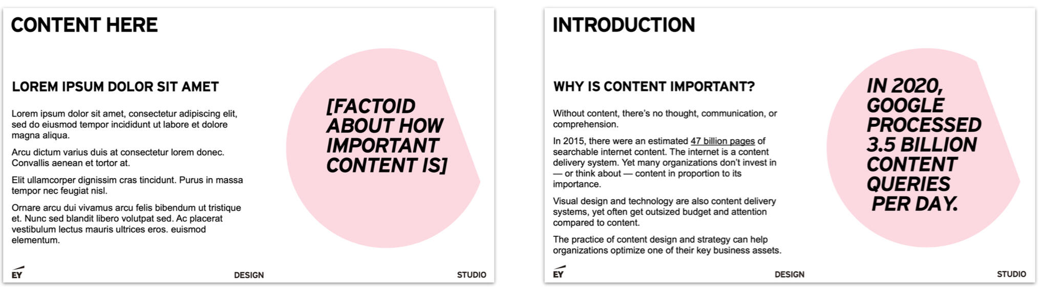
For my full-deck training presentations, I included a playful slide with filler content that built into a slide with actual content. It kinda made my point for me.
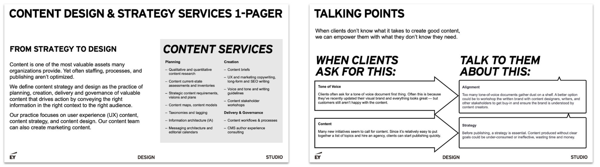
A 1-pager summarized all our offerings conveniently for delivery managers, and talking points helped educate internal stakeholders in how to sell the right thing.
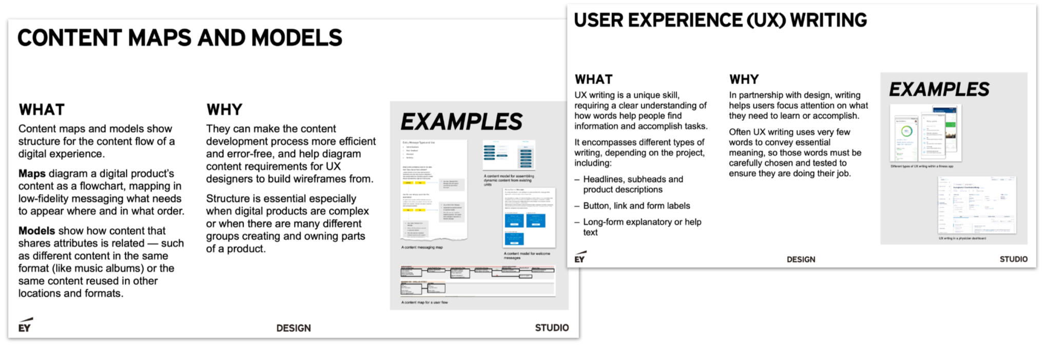
I devoted a slide to each type of client service and associated deliverables.
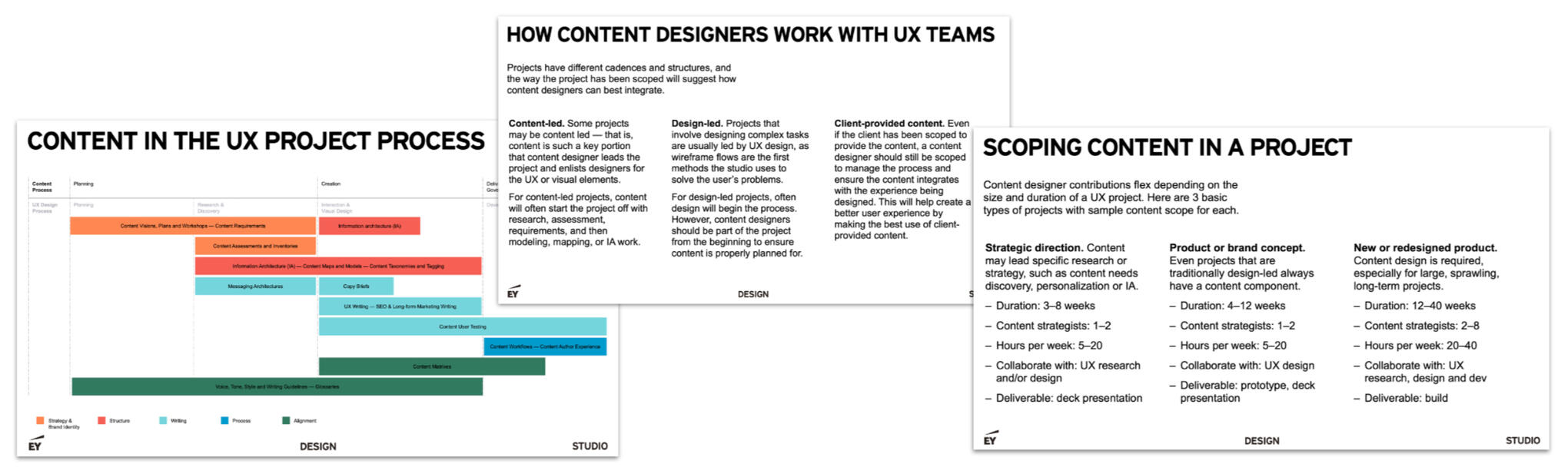
Finally, I showed where content activities could occur within a project timeline, on how content designers work in a team, and specific content scoping info as a quick reference — which was sales and delivery managers' favorite slide.